Comparing MOM6 data to hydrographic section
In this notebook, we show how to compare model’s results with observations using xESMF.
[1]:
import xarray as xr
import xesmf
import zipfile
import pandas
[2]:
import warnings
warnings.filterwarnings("ignore")
[3]:
%matplotlib inline
First we load the sample model data:
[4]:
dataurl = 'http://35.188.34.63:8080/thredds/dodsC/OM4p5/'

ds = xr.open_dataset(f'{dataurl}/ocean_monthly_z.200301-200712.nc4',
                     chunks={'time':1, 'z_l': 1}, engine='pydap')
Then we download data from Calcofi:
[5]:
!curl -O https://cappuccino.ucsd.edu/downloads/2012/20-1202NH_CTDFinalQC.zip
  % Total    % Received % Xferd  Average Speed   Time    Time     Time  Current
                                 Dload  Upload   Total   Spent    Left  Speed
100 36.9M  100 36.9M    0     0  3933k      0  0:00:09  0:00:09 --:--:-- 5815k  0:00:03  0:00:19 1672k07  0:00:05 4261k
We need to play a bit with the zip file to read the data into a pandas dataframe:
[6]:
with zipfile.ZipFile('20-1202NH_CTDFinalQC.zip', 'r') as archive:
    data = archive.extract('db_csvs/20-1202NH_CTDBTL_001-075D.csv')
    df = pandas.read_csv('db_csvs/20-1202NH_CTDBTL_001-075D.csv')
[7]:
df
[7]:
| Project | Study | Ord_Occ | Event_Num | Cast_ID | Date_Time_UTC | Date_Time_PST | Lat_Dec | Lon_Dec | Sta_ID | ... | SaltB | OxB | OxBuM | Chl-a | Phaeo | NO3 | NO2 | NH4 | PO4 | SIL | |
|---|---|---|---|---|---|---|---|---|---|---|---|---|---|---|---|---|---|---|---|---|---|
| 0 | CalCOFI | 1202NH | 1 | 7.0 | 1202_001d | 27-Jan-2012 23:57:08 | 27-Jan-2012 15:57:08 | 32.95690 | -117.30751 | 093.3 026.7 | ... | 33.3669 | 6.546 | 285.89 | 1.826 | 0.239 | 0.0 | 0.00 | 0.00 | 0.24 | 0.5 |
| 1 | CalCOFI | 1202NH | 1 | 7.0 | 1202_001d | 27-Jan-2012 23:57:43 | 27-Jan-2012 15:57:43 | 32.95685 | -117.30740 | 093.3 026.7 | ... | NaN | NaN | NaN | NaN | NaN | NaN | NaN | NaN | NaN | NaN |
| 2 | CalCOFI | 1202NH | 1 | 7.0 | 1202_001d | 27-Jan-2012 23:57:44 | 27-Jan-2012 15:57:44 | 32.95684 | -117.30740 | 093.3 026.7 | ... | NaN | NaN | NaN | NaN | NaN | NaN | NaN | NaN | NaN | NaN |
| 3 | CalCOFI | 1202NH | 1 | 7.0 | 1202_001d | 27-Jan-2012 23:57:45 | 27-Jan-2012 15:57:45 | 32.95684 | -117.30740 | 093.3 026.7 | ... | 33.3678 | 6.589 | 287.79 | 1.581 | 0.300 | 0.0 | 0.00 | 0.00 | 0.24 | 0.5 |
| 4 | CalCOFI | 1202NH | 1 | 7.0 | 1202_001d | 27-Jan-2012 23:57:46 | 27-Jan-2012 15:57:46 | 32.95684 | -117.30738 | 093.3 026.7 | ... | NaN | NaN | NaN | NaN | NaN | NaN | NaN | NaN | NaN | NaN |
| ... | ... | ... | ... | ... | ... | ... | ... | ... | ... | ... | ... | ... | ... | ... | ... | ... | ... | ... | ... | ... | ... |
| 33408 | CalCOFI | 1202NH | 75 | 882.0 | 1202_075d | 12-Feb-2012 03:57:53 | 11-Feb-2012 19:57:53 | 35.08678 | -120.77914 | 076.7 049.0 | ... | NaN | NaN | NaN | NaN | NaN | NaN | NaN | NaN | NaN | NaN |
| 33409 | CalCOFI | 1202NH | 75 | 882.0 | 1202_075d | 12-Feb-2012 03:58:00 | 11-Feb-2012 19:58:00 | 35.08677 | -120.77916 | 076.7 049.0 | ... | NaN | NaN | NaN | NaN | NaN | NaN | NaN | NaN | NaN | NaN |
| 33410 | CalCOFI | 1202NH | 75 | 882.0 | 1202_075d | 12-Feb-2012 03:58:07 | 11-Feb-2012 19:58:07 | 35.08676 | -120.77920 | 076.7 049.0 | ... | NaN | NaN | NaN | NaN | NaN | NaN | NaN | NaN | NaN | NaN |
| 33411 | CalCOFI | 1202NH | 75 | 882.0 | 1202_075d | 12-Feb-2012 03:58:23 | 11-Feb-2012 19:58:23 | 35.08674 | -120.77926 | 076.7 049.0 | ... | 33.6131 | 3.468 | 151.27 | 0.405 | 1.092 | 18.2 | 0.28 | 0.52 | 1.64 | 21.7 |
| 33412 | CalCOFI | 1202NH | 75 | 882.0 | 1202_075d | 12-Feb-2012 03:58:28 | 11-Feb-2012 19:58:28 | 35.08675 | -120.77926 | 076.7 049.0 | ... | NaN | NaN | NaN | NaN | NaN | NaN | NaN | NaN | NaN | NaN |
33413 rows × 82 columns
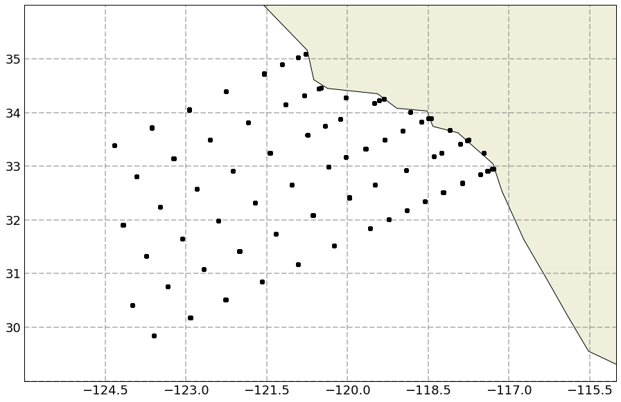
Let’s define a function to plot the longitude/latitude of the stations:
[8]:
import matplotlib.pyplot as plt
import matplotlib.ticker as mticker
from cartopy.mpl.gridliner import LONGITUDE_FORMATTER, LATITUDE_FORMATTER
import cartopy.feature as cfeature
import cartopy.crs as ccrs

def plot_stations(lon, lat):
    fig = plt.figure(figsize=[16,10])
    ax = plt.axes(projection=ccrs.PlateCarree())
    ax.add_feature(cfeature.COASTLINE)
    ax.add_feature(cfeature.LAND)
    ax.set_extent([-126, -115, 29, 36])

    # parallels/meridiens
    gl = ax.gridlines(crs=ccrs.PlateCarree(), draw_labels=True,
                      linewidth=2, color='gray', alpha=0.5, linestyle='--')
    gl.xlabels_top = False
    gl.ylabels_right = False
    gl.xlabel_style = {'size': 18, 'color': 'black'}
    gl.ylabel_style = {'size': 18, 'color': 'black'}

    plt.plot(lon, lat, 'ko')
    return fig
[9]:
fig = plot_stations(df['Lon_Dec'], df['Lat_Dec'])
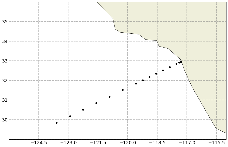
Calcofi is an array with multiple Lines, we can extract lon/lat on a single line using the surface values:
[10]:
df_linesurf = df[['Lon_Dec', 'Lat_Dec']].where(df['Line'] == 93.3).where(df['Depth'] <= 2.0).drop_duplicates().dropna()
[11]:
df_linesurf
[11]:
| Lon_Dec | Lat_Dec | |
|---|---|---|
| 0 | -117.30751 | 32.95690 |
| 59 | -117.28240 | 32.95315 |
| 60 | -117.28262 | 32.95292 |
| 89 | -117.39411 | 32.91489 |
| 608 | -117.53097 | 32.84862 |
| 1123 | -117.86989 | 32.68423 |
| 1639 | -118.21614 | 32.51461 |
| 2156 | -118.55562 | 32.34692 |
| 2672 | -118.89647 | 32.18020 |
| 3190 | -119.23289 | 32.01236 |
| 3705 | -119.57253 | 31.84655 |
| 4221 | -120.24702 | 31.51537 |
| 4736 | -120.91814 | 31.17939 |
| 4737 | -120.91836 | 31.17935 |
| 5253 | -121.58557 | 30.84750 |
| 5770 | -122.25949 | 30.51269 |
| 5771 | -122.25971 | 30.51267 |
| 6286 | -122.91835 | 30.18028 |
| 6801 | -123.58863 | 29.84797 |
[12]:
fig = plot_stations(df_linesurf['Lon_Dec'], df_linesurf['Lat_Dec'])
We can now use these locations to create a xesmf Regrid object and interpolate the model’s data onto these stations. This uses the LocStream capabilities of ESMF. More details can be found in the xESMF documentation on LocStream. The first part is to create a xarray dataset with the stations:
[13]:
ds_locs = xr.Dataset()
ds_locs['lon'] = xr.DataArray(data=df_linesurf['Lon_Dec'], dims=('stations'))
ds_locs['lat'] = xr.DataArray(data=df_linesurf['Lat_Dec'], dims=('stations'))
[14]:
ds_locs
[14]:
<xarray.Dataset>
Dimensions:   (stations: 19)
Coordinates:
  * stations  (stations) int64 0 59 60 89 608 1123 ... 5253 5770 5771 6286 6801
Data variables:
    lon       (stations) float64 -117.3 -117.3 -117.3 ... -122.3 -122.9 -123.6
    lat       (stations) float64 32.96 32.95 32.95 32.91 ... 30.51 30.18 29.85
We can now create the regridding weights and apply to a variable (for example salinity):
[15]:
regridder = xesmf.Regridder(ds.rename({'geolon': 'lon', 'geolat': 'lat'}), ds_locs, 'bilinear', locstream_out=True)
Create weight file: bilinear_576x720_1x19.nc
[16]:
salt_calcofi_line = regridder(ds['so'])
Let’s use the first time record to make a test plot and compare to observations:
[17]:
salt_0 = salt_calcofi_line.sel(time='2003-01-16')
_ = salt_0.load()
We extract and plot the data on the Calcofi Line:
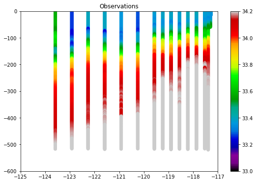
[18]:
df_line = df.where(df['Line'] == 93.3)

plt.figure(figsize=[9, 6])
plt.scatter(df_line['Lon_Dec'], - df_line['Depth'], c=df_line['Salt1'],
            vmin=33, vmax=34.2, cmap='nipy_spectral')
plt.colorbar()
_ = plt.axis([-125, -117, -600, 0])
_ = plt.title('Observations')
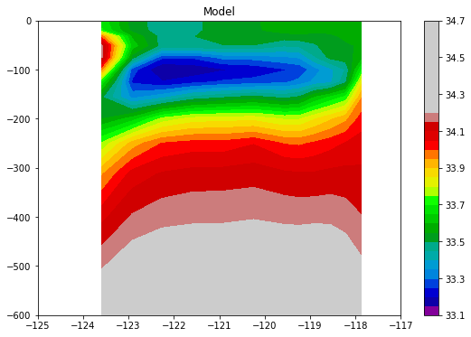
And now the data interpolated from the model:
[19]:
plt.figure(figsize=[9, 6])
plt.contourf(salt_0['lon'], - salt_0['z_l'], salt_0.values.squeeze(), 30,
            vmin=33, vmax=34.2, cmap='nipy_spectral')
plt.colorbar()
_ = plt.axis([-125, -117, -600, 0])
_ = plt.title('Model')
and that’s it!